-
Dear Guest, Please note that adult content is not permitted on this forum. We have had our Google ads disabled at times due to some posts that were found from some time ago. Please do not post adult content and if you see any already on the forum, please report the post so that we can deal with it. Adult content is allowed in the glory hole - you will have to request permission to access it. Thanks, scara
You are using an out of date browser. It may not display this or other websites correctly.
You should upgrade or use an alternative browser.
You should upgrade or use an alternative browser.
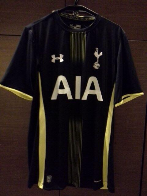
New Kit?
- Thread starter THFC6061
- Start date
Lemonade Money
Steffen Freund
Re: New Away Kit?
Yellow streaks of **** - CL here we come.
This is supposed to be next season's away shirt...

...The AIA logo looks a lot better.
I'm not terribly fond of the go-faster stripes but anything that helps Dawson is an added bonus!
Yellow streaks of **** - CL here we come.
superspurs
Justin Edinburgh
Re: New Away Kit?
\o/
Yellow streaks of **** - CL here we come.
\o/
Armenia Spur
Steven Caulker
Re: New Away Kit?
I like it, anythings better than the Grey, black and Yellow of last season! I blame that kit for us losing against the goons away
I like it, anythings better than the Grey, black and Yellow of last season! I blame that kit for us losing against the goons away
paxtonwolf
John White
Re: New Away Kit?
I like it.
Black and Gold? How does the song go..
I like it.
Black and Gold? How does the song go..
ricky2tricky4city
Tom Huddlestone
Re: New Away Kit?
A what do you blame for losing to the Goons home and away this year? ...........oh hold up and the fa cup too
I like it, anythings better than the Grey, black and Yellow of last season! I blame that kit for us losing against the goons away
A what do you blame for losing to the Goons home and away this year?
Armenia Spur
Steven Caulker
Re: New Away Kit?
Levy
A what do you blame for losing to the Goons home and away this year?...........oh hold up and the fa cup too

Levy
Sandman
Dean Austin
Re: New Away Kit?
Its like we have an identikit now of possible strips and they turn them over every season. That looks like that navy and yellow one we had from Puma. I hate Navy with the yellow. either do yellow kit or a Navy and white kit.
I bloody hope we have blue shorts and white socks for our home kit next season also.
Seeing as we know we have UA for our Kit manufacturer and we also know we have AIA. There seems to be no reason why we cannot release the kit earlier this year. I think we wont see though until after the season ends due to still having HP on our kit.
mudshark
Chris Armstrong
Re: New Away Kit?
Meh, I've given up entirely on replica shirts other than classic ones pre-90s. I've hated nearly every one they've brought out in the past decade or more, really; there always has to be ріѕѕ-streaks or some other inappropriate third colour ruining the look and, above all, I. WILL. NOT. buy a shirt with a red sponsor's logo on. Fuсking jam stains make me ill. You look at, say, the City kit and you realise that, even in this day and age, it is still actually possible to produce something simple, stylish and classy. With our colours, we should be able to do even better than them, but Spurs always seem to get it so wrong. Let them get on with it, though; if people want to spend their money on tat like it, it's up to them.
Meh, I've given up entirely on replica shirts other than classic ones pre-90s. I've hated nearly every one they've brought out in the past decade or more, really; there always has to be ріѕѕ-streaks or some other inappropriate third colour ruining the look and, above all, I. WILL. NOT. buy a shirt with a red sponsor's logo on. Fuсking jam stains make me ill. You look at, say, the City kit and you realise that, even in this day and age, it is still actually possible to produce something simple, stylish and classy. With our colours, we should be able to do even better than them, but Spurs always seem to get it so wrong. Let them get on with it, though; if people want to spend their money on tat like it, it's up to them.
Yiddo
Ian Walker
Re: New Away Kit?
That's been our best kit for years.
I like it, anythings better than the Grey, black and Yellow of last season! I blame that kit for us losing against the goons away
That's been our best kit for years.

