-
Dear Guest, Please note that adult content is not permitted on this forum. We have had our Google ads disabled at times due to some posts that were found from some time ago. Please do not post adult content and if you see any already on the forum, please report the post so that we can deal with it. Adult content is allowed in the glory hole - you will have to request permission to access it. Thanks, scara
You are using an out of date browser. It may not display this or other websites correctly.
You should upgrade or use an alternative browser.
You should upgrade or use an alternative browser.
Kit Thread
- Thread starter Nutter-Naylor
- Start date
bainz
Dean Marney

is it me or is that page still on photoshop? im no photoshop expert but the stuff is still there? and the 'I WILL' is not in line with the angle of the screen... so im guessing FAKE
superspurs
Justin Edinburgh
If that's the shirt I'd be rather pleased.
Especially if it also includes an all Navy away kit with the badge, logos etc all in white.
Especially if it also includes an all Navy away kit with the badge, logos etc all in white.
Lemonade Money
Steffen Freund
Much better than the chevronathon a few pages back, but needs some yellow streaks of tinkle if we want CL
Millsy_Yiddo
Naybet
Would be well happy with that if it's legit.
thfcsteff
Terry Dyson
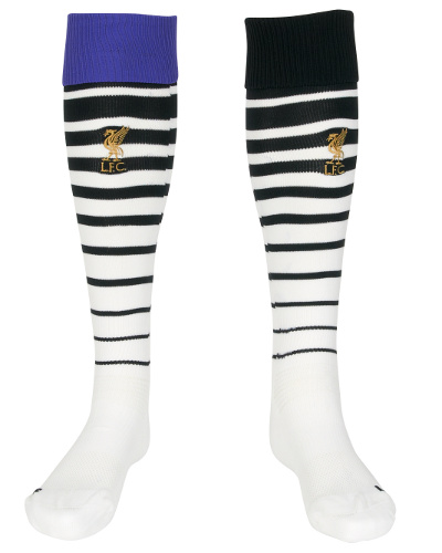
He looks like he's wearing that as punishment
So SO true! That abusive on the eyes...
thfcsteff
Terry Dyson
Odd socks?!?

This honestly looks like a royal jester from some medieval reinactment after bing shoved through a blender.


Ossie
Scott Houghton
where'd it go?
Anyone?! Bueller?
raboner
Banned
Really really like this.. fudge moaning about the sponsor colour, if that's the colour of their brand then so be it.. The entire kit looks glorious though.
raboner
Banned
Go to www.hp.com .. The hp logo is the same light blue, big brands don't like having their colours fudged about with, it's like asking tottenham to change from navy blue to suit a sponsors colour, same brick different smell.
Mumorn
Vic Buckingham
Go to www.hp.com .. The hp logo is the same light blue, big brands don't like having their colours fudged about with, it's like asking tottenham to change from navy blue to suit a sponsors colour, same brick different smell.
they also have a navy blue logo though.. thats there old logo anyway.

Mumorn
Vic Buckingham
Old being the key term here Mumorn, why would they use an outdated logo that doesn't represent their current identity just to suit tottenham hotspur?
i meant the hp one we're talking about, the one on the kit.. it's their old logo.