• Dear Guest, Please note that adult content is not permitted on this forum. We have had our Google ads disabled at times due to some posts that were found from some time ago. Please do not post adult content and if you see any already on the forum, please report the post so that we can deal with it. Adult content is allowed in the glory hole - you will have to request permission to access it. Thanks, scara

Kit Thread

Like the way they announce "Premier League away kit" like that is so important! lol

Massive club innit.

Orient chairman Barry Hearn, who has previously criticised the Hammers' plans , told BBC Sport he would be interested in a possible ground share.

But West Ham insist they are not considering such an arrangement.

"West Ham United has not held talks with Leyton Orient in respect of ground sharing and nor is it our intention to do so," their statement said.

"We do not wish to comment on recent statements made by Barry Hearn not least because we can't keep up with his ever-changing position.

"They continue, however, to provide us with a constant source of amusement.'

It's a bit rich for anyone to do with West Ham United to accuse others of being a source of amusement. This is the club which yo-yo's up and down the divisions more often than a bungee jumper, and yet were - apparently - destined for the Champions League only a few seasons ago?

If they want serious side-splitting humour, then they'd only need visit their own website which details their only claim to 'fame' being...tenuous links to 'winning' the World Cup in 1966. Perhaps some pictures on there too of their 'glorious' open-top bus ride through Canning Town, showing off their sparkly Championship Play Off piece of tat.
 
AswnVskCEAAkWGi.jpg:large

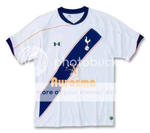
The badge not only looks too small but also quite badly possitioned within the stripe too... Like is just slapped on anywhere
 
The badge not only looks too small but also quite badly possitioned within the stripe too... Like is just slapped on anywhere

We've seen the drafts already, the screen shots were them (third strip is a little diff/developed from the screen shot)...
 
Disagree, this new one is far more horrible, what's the goldy yellow all about,? The stripe looks like an after thought

Sent from my Nexus S using Fapatalk 2

Agree, I didn't mind the other "tinkle stain" shirt as, bottom line, it still looked like a Spurs shirt.

But that thing? When the fudge has Tottenham Hotspur ever had some stupid diagonal stripe? :|

I'd have to consider supporting West Ham if we adorned that abomination.
 
The kit will look much better with shorts etc, never looks as good just looking at the top.Can imagine it looking ok with some navy shorts....
 
That is not our kit. I very much doubt Levy would allow it. If he did, consider that specific revenue stream (merchandising etc) to go right down.

Its fudgein hideous.

Im gonna make my own spurs top and get someone to do it and will wear it.
 
I'm surprised at the scorn for the diagonal stripe (not saying I like it) - lots of posters loved the kit with the diagonal blue should section a couple of seasons ago (perhaps because it followed the tinkle-stain shirt?).
 
I'm surprised at the scorn for the diagonal stripe (not saying I like it) - lots of posters loved the kit with the diagonal blue should section a couple of seasons ago (perhaps because it followed the tinkle-stain shirt?).

Its not the diagonal stripe im concerned about (although I hate it) its the fudgein colours. You have one side with yellow piping, the other side doesnt. The diagonal stops at an awkward point at the shoulder and doesnt seem natural. The peach coloured sponsor is hideous and seems low down. Not to mention the ****erel and UA logo seem to be too central and in awkward positions.

To be honest IT IS brick and I have the impression that some drunk prick designed it.
 
I'm surprised at the scorn for the diagonal stripe (not saying I like it) - lots of posters loved the kit with the diagonal blue should section a couple of seasons ago (perhaps because it followed the tinkle-stain shirt?).

I guess the difference is that kit still looked like a Spurs kit, whereas this looks like the kit from some South American team. It's not a Spurs shirt and more importantly nobody will buy it.
 
fudge me, this has got to be a joke. All time low if we get this. Horrible.

If, and I mean if we get this shirt, I only hope the 2nd and 3rd team shirts will be better, otherwise my "hard earned" will stay in my pocket. To be fair, the only white shirt I've liked in the last 4 or 5 years has been the "Investec Cup" edition, it was simple, it was quality and it had no red on it.
 
Back