Yiddo
Cecil Poynton

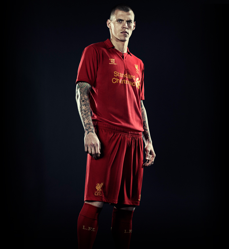
That sponsor ruins what looks to be a good kit.
not necessarily.I can't even quantify how much better it is with the navy blue logo. It's a brick kit with light blue, turning into one of our best ever with the navy blue. What the sponsor wants the sponsor gets I suppose.


Not sure if posted already but saw this on SC. Looks to be the kit that GB is wearing in that 'TV' picture.

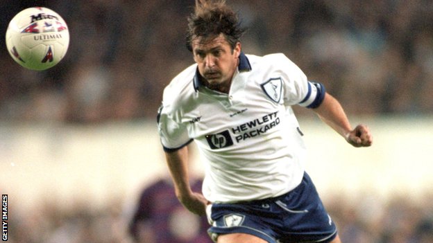
Will prefer if "Hewlett Packet" is spelled in full under the logo, just like it was during the 1995-1999 seasons. It will make the shirt more popular among non-Spurs fans and even non-Sports fans due to it's famous IT company name.
I can't even quantify how much better it is with the navy blue logo. It's a brick kit with light blue, turning into one of our best ever with the navy blue.What the sponsor wants the sponsor gets I suppose.
not necessarily.
This is the official logo of Standard Chartered Bank [...]
I'm sure someone said it was made by a guy on another forum?Photoshopped. Pixelated around the collar
I highly doubt the designers would be that stupid to have the logo in the light blue colour, just not classy. Not overly keen on the cowboy tie either...
But there was a contrast (red and blue opposite ends of the spectrum I believe?). You can't have 2 shades of blue - it's awful.
Not sure if posted already but saw this on SC. Looks to be the kit that GB is wearing in that 'TV' picture.
