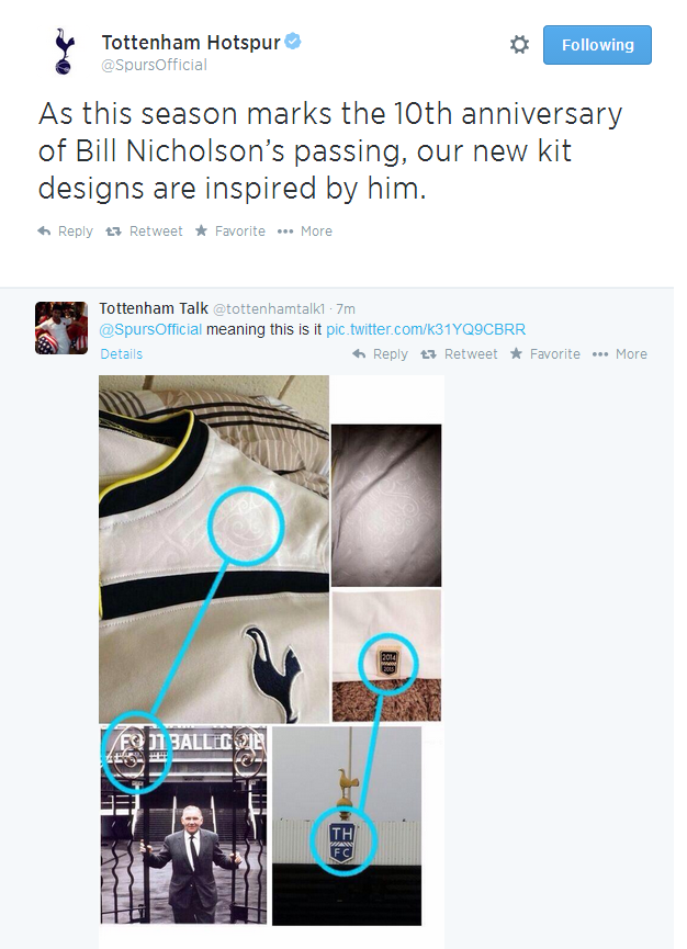
• Dear Guest, Please note that adult content is not permitted on this forum. We have had our Google ads disabled at times due to some posts that were found from some time ago. Please do not post adult content and if you see any already on the forum, please report the post so that we can deal with it. Adult content is allowed in the glory hole - you will have to request permission to access it. Thanks, scara

New Kit?

As this season marks the 10th anniversary of Bill Nicholson’s passing, our new kit designs are inspired by him.
-

That'll explain the gates design.
 
Reminds me a little of the University of Michigan football and basketball uniforms.

yeah man. Unfortunately for me the key difference with ours is the red.

White with a splash of navy blue and yellow looks sharp (IMO), just like it does on those American football kits.

But white with splashes of navy blue and yellow plus a big fat dollop of ugly red... that just doesn't go. Not a colour combination used often and for good reason!!

... so yeah. I'm not buying this s**t, if indeed it is the key. I know Levy ain't gonna turn the sponsership money down, it's a great commercial deal for us yada yada, but only way I can vote is with my wallet.
 
That detail on the shoulders looks like it's taken its inspiration from a Tottenham rude boy's haircut
 
oxNsCGV.png
 
Im sorry but I dont see how some curls from our old gates can represent Bill. Its horrible little detail that goes with the **** stains. Should have honored him by having a kit reminiscent of his time as manager not this tripe.
They have to have details like this to make the shirts more difficult to counterfeit (or at least make it easier to spot fakes). I think that it is a quite nice idea to take inspiration for this from an element of one of the most famous photos of Bill Nic.

It is not as if they have said that this is the only thing the club will do to make the tenth anniversary of his death.
 
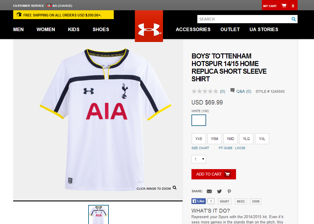
These kits always end up looking better 'in the flesh' than in spoiler pics.

They also always look a lot better with the shorts and socks on, I think this one will look ok on the players....

This for me too.

Quite a few shirts have looked awful to me in pics like these and then looked just fine on the players during games.

The yellow, dark blue and red combination doesn't look great in that pic though...
 
Can I suggest that all those who currently hate the kit will have one by Christmas?!

They nearly always look **** until they're launched and then played in.
 
There's always a lot of whining and moaning over the new kits during the summer, then the season starts, and nobody cares after a few games. I'm happy as long as we're getting yellow third kits. \o/
 
Seriously that kit will just make us look like little kids... its like the baby blue kit in that its just a laughable kit. It may look better in real life so to speak.

It really is not difficult to design a kit.
 
Back