Gutter Boy
Tim Sherwood
This is quite interesting
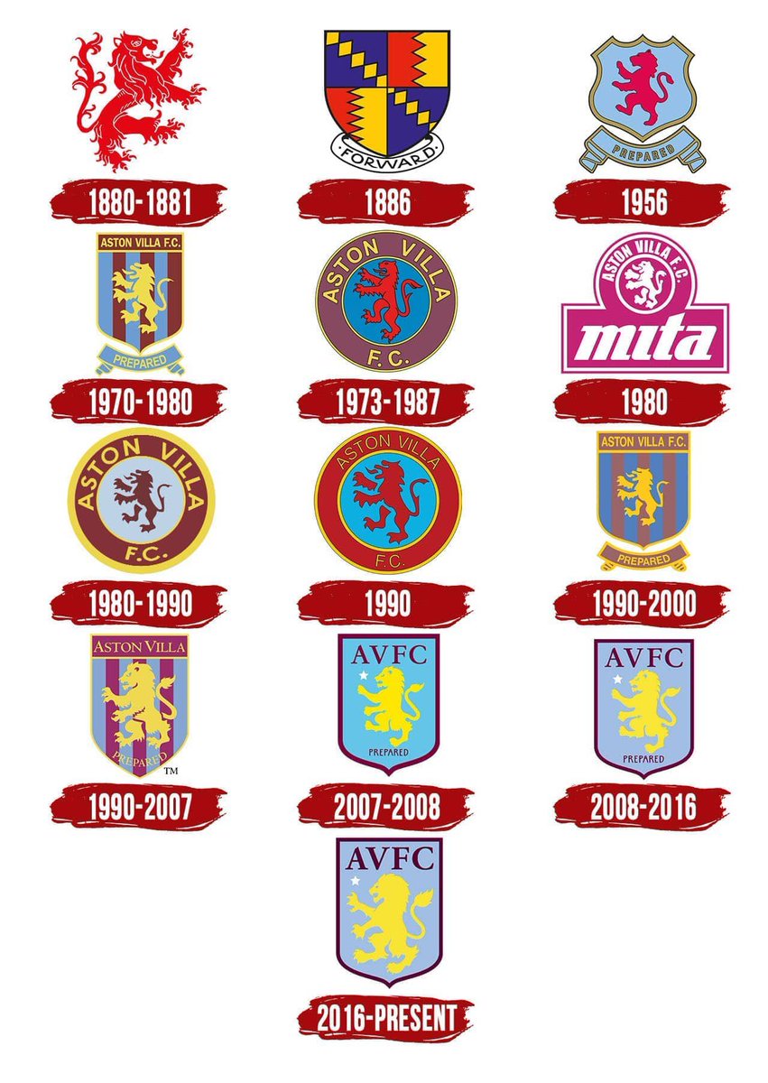
I think our 2013 redesign was actually done reasonably well, although it's probably my least favourite of the six.
none of them look like a Bird do they. 1972 for gawds sake.
1999 looks like someone was tinkled off with someone for changing it in 1989!
It's all about designing a badge that can be copy righted.
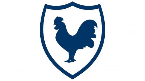
What if our rooster is facing the wrong way? Is it looking backwards, rather than forwards? Did the goons fortune improve once their gun started facing forwards?
What if our rooster is facing the wrong way? Is it looking backwards, rather than forwards? Did the goons fortune improve once their gun started facing forwards?

This is quite interesting
It's arse looks like Homer Simpson with a toupe!The 1920s actually looks like a badger
https://1000logos.net/tottenham-hotspur-logo/
I quite like the retro-ness of the 1972 one - I've got an antique iron cast version of that on my landing
Better/bolder colours in the redesign though. I quite like the Bruce Castle element
As for the Villa ones, it's only just dawned on me how silly the 'lion' looks. Never seen one standing on 2 legs unless you count the 'Wizard of Oz'.
As for the Villa ones, it's only just dawned on me how silly the 'lion' looks. Never seen one standing on 2 legs unless you count the 'Wizard of Oz'.
Ffs, even villa have changed their badge to look forward. We're getting left behind.Villa changing theirs next season.
We use essential cookies to make this site work, and optional cookies to enhance your experience.