• Dear Guest, Please note that adult content is not permitted on this forum. We have had our Google ads disabled at times due to some posts that were found from some time ago. Please do not post adult content and if you see any already on the forum, please report the post so that we can deal with it. Adult content is allowed in the glory hole - you will have to request permission to access it. Thanks, scara

New Kit?

28B42B2400000578-3082320-image-m-2_1431677641341.jpg
Superhero
 
I think it looks great - especially the keeper strip. But.... I'm on the wrong side of the Atlantic. ;)
 
WTF is a "Heritage Sash"?

Unless I'm blind there's no sash on that chart of Steff's. Heritage my arse :mad:
 
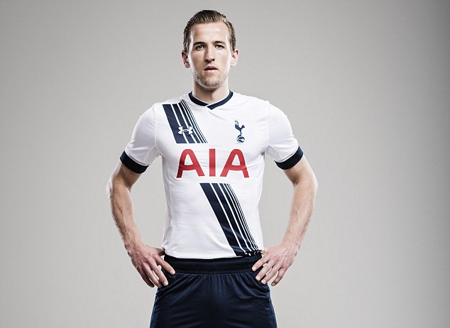
I believe the sash is supposed to resemble this:

http://i.dailymail.co.uk/i/pix/2007/07_01/Tottenhamrooster_468x533.jpg

Although doesnt look very similar.
 
Really like it. If I was in the mood to be pedantic, I'd say that the sash starting at the shoulder looks a bit cheap in the absence of a blue stripe running across it for said sash to emerge from - sort of looks like it was hurriedly copied and pasted onto the front of an otherwise white shirt. But nonetheless, I like it. Best kit since the 2010-2011 one, for me.
 
"Heritage sash" :D

They do come out with some quality guff to explain these things. I guess "well we have to change the plain white shirt somehow every year or you lot wouldn't coin up" wouldn't really cut it.
 
Kit is lovely imo.

Every season we get posters wanting a plain white shirt - imagine that every season! They'd be complaining that we're being ripped off!

As for a plain sash rather than the one we have. I think a plain one would be more representative of a club that has one every season as part of their kit (if that makes sense).

No yellow and unfortunately I've gotten used to the red AIA logo (helps that it's simpler than Mansion!)
 

Like the new kit. It looks totally different from all our previous shirts. In fact, this is the first time in our history that we have strip across the shirt. But frankly, that strip across looks a bit amateurish and old-fashioned. I think it is the fashion of the 1970s and 1980s where many teams used to have strip-across like that. But I think it is better than those boring plain-white shirts.
 
I thought DL had a formula so to speak. One season its a White shirt with Blue on, next season its a plain shirt and maybe blue socks instead. And then the next season its a white shirt with blue little bits. Rinse and repeat.

The sash is ok? but it really empthasises the AIA logo. Maybe that is what they were going for but it makes the logo look massive. Now do a reverse of this shirt. Navy with white and White AIA and im all in. Its a nice enough kit, just nothing spectacular.
 
Back