• Dear Guest, Please note that adult content is not permitted on this forum. We have had our Google ads disabled at times due to some posts that were found from some time ago. Please do not post adult content and if you see any already on the forum, please report the post so that we can deal with it. Adult content is allowed in the glory hole - you will have to request permission to access it. Thanks, scara

New Kit?

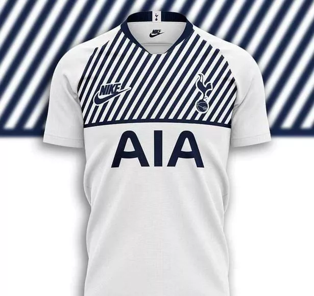
"the Tottenham Hotspur 2019-20 home kit is set to do away with the gradient look this season. It will be predominantly white, while dark blue will once again be used for the logos.
The shorts are expected to be navy and the socks will be white".

I don't know how they do it, I really don't! These guys are fvckin' geniuses! :rolleyes:

(genii? - no apparently! - google it!)

Oh, and the expression "template" and worst still "global template" crops up a little too frequently for my liking :mad:
 
https://www.football.london/tottenham-hotspur-fc/news/new-spurs-home-kit-news-15886878

Rumoured shirt (every chance its a fake)

0_FB_IMG_1551168142215.jpg
 
The only think I like is the retro Nike tick and the sponsor not being red, which also happen to be the two bits that are obviously fake...

I actually think Nike will be using that old logo next year. No idea where I heard about it though. Maybe a few pages back? But they do seem to be putting it on a lot of there clothing again recently.
 
fudge that's bad. As in, contender for worst kit ever. And you can't read the sponsors logo for good measure.
Hopefully the fact that Nike hasn't made out kits for long will save us from something similar.

I normally try to find the positives with these things, but fudge me that is fudging fugly.

The concept alone is just, what the fudge. It's so fudging bad in every way, from original idea to final execution. Burn it with fire.
 
Back